The disappearing PC

The article below is a couple months old but interesting to look back on now the iPad has sold close to 4 million units, supporting Job's point of view.

Ballmer commented yesterday that Apple's sold more iPads than he would like. He was surprised by the iPhone, and is surprised by the iPad. After all, Microsoft was already selling phones, and tablets, and if so many people wanted them, they'd have bought them ... right?

You see the problem in Ballmer's iPad interview below. He thinks everything is a PC, just evolving form factors. The hardware shape changes like a fashion fad, but it's still a PC, and people are going to do the same things on it.

On the contrary, it's not the hardware form factor people are excited about. Joe Wilcox didn't repurchase an iPad because it was fashionable. It's the shape of the software — the usability. The iOS multi-touch platform pushes the OS into the background, putting goal-oriented apps front and center.

Everyday people (tech geeks call these people "normals") can poke a button for the thing they want to do, and the device becomes a tool to accomplish that thing. Your goal, in a sleek metal frame.

It's not a personal computer riddled with OS anxiety between you and your goal. Turn it on and it's a personal radio, Facebook, magazine, navigator, or photo album. It's whatever you need it to be at the time, and nothing else.

Steve Jobs' and Steve Ballmer's starkly different visions of the future

"PCs are like trucks," Apple (AAPL) CEO Steve Jobs told Walt Mossberg Tuesday night at the Wall Street Journal's D8 conference. When America stopped being an agrarian society, people started buying cars. Devices like the iPhone and the iPad, in Jobs' analogy, are the cars of computing as society transitions into what he calls the "post PC world."

"And this transformation is going to make some people uneasy," he predicted. "People from the PC world."

Enter Steve Ballmer, CEO of Microsoft (MSFT), who was, in his D8 turn two days later, the embodiment of the uneasy PC guy, whether attacking Google's (GOOG) "incoherent" operating system strategy, damning Research in Motion (RIMM) with faint praise, or dissing Apple as living in "the bubble of Terranea" -- a reference to the swanky resort where the conference was held and whose participants could afford to own "five devices per person."

All Things D has posted excerpts of Ballmer's interview (along with Ray Ozzie, Microsoft's chief software architect) on its D8 site. We've pasted several below the fold, along with the Steve Jobs video that includes his vision of the post-PC world. It begins at the 3:30 mark in the first clip. Ballmer's response is in the video about the iPad.


Steve Jobs on the iPad and the post-PC world:

Steve Ballmer on the iPad:

Ballmer and Ozzie on cloud computing:

Ballmer on the battle for control of the mobile phone business:

Usability week ending July 25th

Friday, 23rd July, 8:56 AM
Balancing #science and #art -- human-computer interaction #design benefits substantially from a #creative approach: http://j.mp/atXjOX #ux

Thursday, 22nd July, 5:00 PM
#Endeca launches UI Design Pattern Library -- understand users, create potential solutions, and evaluate and optimize: http://j.mp/dkxHRB

Thursday, 22nd July, 8:51 AM
Information networks and living cities provide a basis for understanding each other, and information architecture: http://j.mp/aCfSUs #ia

Tuesday, 20th July, 10:54 AM
Supporting User Experience and User Centered Design throughout the Product Development process: http://j.mp/aQ1P3P #ux #ia #ucd

via twitter.com/terretta

Usability week ending July 18th

Thursday, 15th July, 8:50 PM
Sketching is an important pre- #wireframing technique for doing divergent and transformative #design: http://j.mp/cBgxQD #ux #ia

Wednesday, 14th July, 10:25 PM
#Complexity may be unavoidably inherent to a workflow and tasks, or in the density of information to present: http://j.mp/9VYVyt #ux #ia #ui

Tuesday, 13th July, 12:51 PM
"Dark patterns" purposely trick users into doing things they wouldn’t otherwise have done: http://j.mp/cOpkpb #ux #usability #ia

via twitter.com/terretta

Usability week ending July 11th

Thursday, 8th July, 9:32 AM
Getting rid of #hover makes the web better; no substitute for concise content, clear interaction, simple design: http://j.mp/ctSSKb #ux #ui

Wednesday, 7th July, 10:32 PM
How to make a customer experience map--the graphical representation of the service journey of a customer: http://j.mp/9x7lFA #ux #ia

Tuesday, 6th July, 11:55 AM
"Good UI design encourages playful exploration in the app--people feel a sense of wonder and excitement": http://j.mp/bxvzkO #microsoft #ux

via twitter.com/terretta

Usability week ending July 4th

Friday, 2nd July, 11:56 AM
#Interface #design vs #interaction design--avoid beautiful-looking but ultimately confusing and difficult to use #UI: http://j.mp/c5qy1K #ux

Wednesday, 30th June, 9:31 AM
Tips for building #wireframes for web #UI information architecture: http://j.mp/cPwsn0 #ia

Monday, 28th June, 6:18 PM
Four attributes define the future online customer experience -- customized, aggregated, relevant, social: http://j.mp/dgp96K #ux

Sunday, 27th June, 12:29 AM
RT @karenmcgrane: Saying UX for the web consists of IA, IxD, and visual design is like saying Christmas presents consist of boxes, tape, ...

via twitter.com/terretta

Usability week ending June 27th

Thursday, 24th June, 10:39 AM
Ultimate #guide to A/B Testing--what it is, what to test, how to test, classic #test results: http://j.mp/9QGh77 #ux #conversion #marketing

Wednesday, 23rd June, 11:27 AM
The plague of any software product is the moment when non-experts in user interface #design get to look at the #UI: http://j.mp/cRPH4h #ux

Tuesday, 22nd June, 5:31 PM
Intuition is learned. Stop obsessing over whether a #UI is intuitive; start obsessing whether it’s understandable: http://j.mp/aEgT8w #ux

Tuesday, 22nd June, 1:38 PM
Is it really acceptable, much less a good idea, for web sites to require #JavaScript?: http://j.mp/9VgVWz #usability #ux #ui #ajax

Tuesday, 22nd June, 10:31 AM
The beauty of #typography--writing systems and #calligraphy of the world inform #design of international projects (pt.2): http://j.mp/9DNiH2

Monday, 21st June, 3:11 PM
Even a few seconds' delay is enough to create an unpleasant user experience: http://j.mp/9HUo1o #ux #performance #speed

Monday, 21st June, 10:11 AM
Three levels of happiness to #design into remarkable user experiences: Mindfulness, Flow, and Meaning: http://j.mp/bAzbsa #ux #usability

via twitter.com/terretta

Google Voice's clever and informative advertorial infographic

Infographics are everywhere, but with their increasing popularity I've noticed they're decreasingly informative.  An infographic should convey information graphically.  Somehow the concept was corrupted into bright pastel cartoon images layered behind paragraphs of Helvetica text with numbers.  That's not an infographic; it's just a poster.

This is a an example of an infographic done well also serving as advertisement: blending the visual timeline and graph with the marketing "information" placing Google Voice firmly at the right end of the timeline, while still illustrating its roots.  From the carefully worded headline to the march of progress digits to the timeline to the branded Google Voice icon, anyone can visualize that the "insanely" great features of this new technology are the combination and evolution of the old.

(On the other hand, the telephone number formatting of the timeline icons feels gratuitous, along with the '50s colored dots.  Google enjoys Easter Eggs.  Is it an actual phone number?  If so, it's not as simple as initial caps on touch tone keys, as the T's have different backgrounds.  The dots do color match the dashed lines.)

found on Google Voice Blog

Usability week ending June 20th

Friday, 18th June, 2:25 PM
What can print designers do to embrace the web? http://j.mp/a10vTv

Thursday, 17th June, 8:13 AM
Do you really want part of my sign-up experience to be that you tell me that my name is invalid?: http://j.mp/9hEfW0 #ux #ia #dba

Wednesday, 16th June, 11:44 AM
"All design is human-centered. If it's not human-centered, then it's not design...": http://j.mp/9ufhBS #design #usability #ux

Wednesday, 16th June, 11:28 AM
@Memeo_Inc Fix http://www.memeoconnect.com/beta_signup.php to support + sign in email address--it's a GMail feature, after all.

Tuesday, 15th June, 6:13 PM
iPad so inviting that customers are drawn to interacting with (or at least observing) payment transactions: http://j.mp/cdvdLT #ux #ipad

Monday, 14th June, 5:25 PM
Huge success of iPhone, Craigslist, Google, Twitter shows importance of #simplicity vs a large feature set: http://j.mp/cf0gFU #ux

via twitter.com/terretta

Usability week ending June 13th

Friday, 11th June, 9:57 AM
Publishers, your webpages are hostile to reading. Love your readers and #design for #readability, or die: http://j.mp/a73PgG #ux

Thursday, 10th June, 5:06 PM
#Google takes own advice: "Good #UX isn’t just about good #design. Be open, engaged, surprising, polite" and fast to fix: http://j.mp/djFDN5

Thursday, 10th June, 4:01 PM
The social style guide and why "remove Google background" became a top search term http://post.ly/j61p

Thursday, 10th June, 1:51 PM
“The intention of sketching is to separate design from the process of making.” : http://j.mp/cPj56E #design #ia #ux #wireframe

Thursday, 10th June, 1:49 PM
RT @MSEurope: We've lost a background image, if found please return to bing.com ;)

Wednesday, 9th June, 5:25 PM
In a corporate environment, consensus can be a designer's best friend--if you know when and how to seek it out: http://j.mp/9s2Xhh #design

Tuesday, 8th June, 9:57 AM
Readings on the state of usability art: http://j.mp/terretta

Monday, 7th June, 8:54 AM
User attention is a limited resource and we should heavily optimize to minimize our impact upon it: http://j.mp/94qZTQ #ux #ui #ipad

via twitter.com/terretta

The social style guide and how "remove Google background" became a top search term

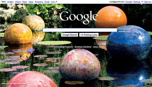
Alarm bells went bing! on every computer in America today as users pulled up Google then double-checked the web address they typed. After adding an image personalization feature last week, today Google forced all users to have a background image on their search page.

Unsurprisingly, the experiment got yanked early.

How did Marrisa Mayer, Google’s Vice President of Search Product and User Experience, get it so wrong? She forgot to check Google's core principles.

A user at Hacker News complained, "It's strange being an unwitting, unwilling guinea pig for something I use every day" and got the snarky reply, "You're entitled to a full refund." Cute, but the user has "paid" Google with his time, attention, and loyalty, which together enable Google's business model.

There's an implied social contract in the phrase "do no evil", and this background image stunt to "showcase" a new personalization feature broke the top three of Google's core values:

As we keep looking towards the future, these core principles guide our actions.

1. Focus on the user and all else will follow.

Since the beginning, we've focused on providing the best user experience possible. Whether we're designing a new Internet browser or a new tweak to the look of the homepage, we take great care to ensure that they will ultimately serve you, rather than our own internal goal or bottom line. Our homepage interface is clear and simple, and pages load instantly. Placement in search results is never sold to anyone, and advertising is not only clearly marked as such, it offers relevant content and is not distracting. And when we build new tools and applications, we believe they should work so well you don't have to consider how they might have been designed differently.

This background image did not serve you. It did not leave the interface clear and simple. The page did not load instantly.

2. It's best to do one thing really, really well.

We do search. With one of the world's largest research groups focused exclusively on solving search problems, we know what we do well, and how we could do it better. Through continued iteration on difficult problems, we've been able to solve complex issues and provide continuous improvements to a service that already makes finding information a fast and seamless experience for millions of people. Our dedication to improving search helps us apply what we've learned to new products, like Gmail and Google Maps. Our hope is to bring the power of search to previously unexplored areas, and to help people access and use even more of the ever-expanding information in their lives.

Google's search page is supposed to be so focused on search, its design is often shown as a march towards minimalism. Famously, a recent design iteration made most navigation elements invisible until the mouse moved, focusing attention on the single search box.

Today's forced "feature" staggered in the opposite direction, making the "one thing" page difficult to read and requiring a user to add a Google Account and sign in if the user wanted to get rid of the visual distraction from search.

3. Fast is better than slow.

We know your time is valuable, so when you're seeking an answer on the web you want it right away – and we aim to please. We may be the only people in the world who can say our goal is to have people leave our homepage as quickly as possible. By shaving excess bits and bytes from our pages and increasing the efficiency of our serving environment, we've broken our own speed records many times over, so that the average response time on a search result is a fraction of a second. We keep speed in mind with each new product we release, whether it's a mobile application or Google Chrome, a browser designed to be fast enough for the modern web. And we continue to work on making it all go even faster.

There's no question that a desktop sized .jpg image is orders of magnitude slower than no image at all.

Now, after web-wide outcry, the original blog entry at Google has been updated:

We had planned to run an explanation of the showcase alongside it—in the form of a link on our homepage. Due to a bug, the explanatory link did not appear for most users. As a result, many people thought we had permanently changed our homepage, so we decided to stop today’s series early.

Sure. It was really just a bug.

Google's ten things have helped make the web better, and users appreciate Google for that. It's no coincidence most of Google's so-called missteps in the past year have been violations of one or more of these ten principles.

Users don't like to feel used, so social usability matters even more than typography or information architecture.

Web application user experience managers should keep their implied—or in Google's case, written—social contracts in mind to guide design decisions: a social style guide.