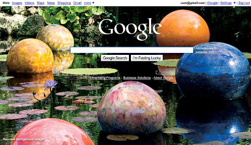
Alarm bells went bing! on every computer in America today as users pulled up Google then double-checked the web address they typed. After adding an image personalization feature last week, today Google forced all users to have a background image on their search page.

Unsurprisingly, the experiment got yanked early.
How did Marrisa Mayer, Google’s Vice President of Search Product and User Experience, get it so wrong? She forgot to check Google's core principles.
A user at Hacker News complained, "It's strange being an unwitting, unwilling guinea pig for something I use every day" and got the snarky reply, "You're entitled to a full refund." Cute, but the user has "paid" Google with his time, attention, and loyalty, which together enable Google's business model.
There's an implied social contract in the phrase "do no evil", and this background image stunt to "showcase" a new personalization feature broke the top three of Google's core values:
As we keep looking towards the future, these core principles guide our actions.
1. Focus on the user and all else will follow.
Since the beginning, we've focused on providing the best user experience possible. Whether we're designing a new Internet browser or a new tweak to the look of the homepage, we take great care to ensure that they will ultimately serve you, rather than our own internal goal or bottom line. Our homepage interface is clear and simple, and pages load instantly. Placement in search results is never sold to anyone, and advertising is not only clearly marked as such, it offers relevant content and is not distracting. And when we build new tools and applications, we believe they should work so well you don't have to consider how they might have been designed differently.
This background image did not serve you. It did not leave the interface clear and simple. The page did not load instantly.
2. It's best to do one thing really, really well.
We do search. With one of the world's largest research groups focused exclusively on solving search problems, we know what we do well, and how we could do it better. Through continued iteration on difficult problems, we've been able to solve complex issues and provide continuous improvements to a service that already makes finding information a fast and seamless experience for millions of people. Our dedication to improving search helps us apply what we've learned to new products, like Gmail and Google Maps. Our hope is to bring the power of search to previously unexplored areas, and to help people access and use even more of the ever-expanding information in their lives.
Google's search page is supposed to be so focused on search, its design is often shown as a march towards minimalism. Famously, a recent design iteration made most navigation elements invisible until the mouse moved, focusing attention on the single search box.
Today's forced "feature" staggered in the opposite direction, making the "one thing" page difficult to read and requiring a user to add a Google Account and sign in if the user wanted to get rid of the visual distraction from search.
3. Fast is better than slow.
We know your time is valuable, so when you're seeking an answer on the web you want it right away – and we aim to please. We may be the only people in the world who can say our goal is to have people leave our homepage as quickly as possible. By shaving excess bits and bytes from our pages and increasing the efficiency of our serving environment, we've broken our own speed records many times over, so that the average response time on a search result is a fraction of a second. We keep speed in mind with each new product we release, whether it's a mobile application or Google Chrome, a browser designed to be fast enough for the modern web. And we continue to work on making it all go even faster.
There's no question that a desktop sized .jpg image is orders of magnitude slower than no image at all.
Now, after web-wide outcry, the original blog entry at Google has been updated:
We had planned to run an explanation of the showcase alongside it—in the form of a link on our homepage. Due to a bug, the explanatory link did not appear for most users. As a result, many people thought we had permanently changed our homepage, so we decided to stop today’s series early.
Sure. It was really just a bug.
Google's ten things have helped make the web better, and users appreciate Google for that. It's no coincidence most of Google's so-called missteps in the past year have been violations of one or more of these ten principles.
Users don't like to feel used, so social usability matters even more than typography or information architecture.
Web application user experience managers should keep their implied—or in Google's case, written—social contracts in mind to guide design decisions: a social style guide.