Social business and service design

It is not surprising that almost every business analyst, from whatever field they come from, management, business consulting, marketing, finance…etc predicts that customer experience and customer value in use will be the next big strategic thing, including major players like Forrester research – The State Of Customer Experience, 2010 – and big five consultancies like Cap Gemini. See also for example Emanuele Quintarelli’s summaries of the Enterprise 2.0 Summit 2010 and the “Social CRM Strategies Summit” (Day 1 & Day 2). More fundamental models in business and academia are underlining this new paradigm: Service dominant logic, and lean consumption as an application of lean management .

And that’s exactly the reason why service design (as a generalization of the formerly emerged discipline of User experience design – see Peter Morville, Smashing Magazine & Kimmy Paluch) and design thinking are starting to raise such a high interest: It’s these disciplines that have the tools, methods and people (the designers and design thinkers) necessary to discover & create customer value and experience, the new ingredients for success and competitiveness in business.

The disappearing PC

The article below is a couple months old but interesting to look back on now the iPad has sold close to 4 million units, supporting Job's point of view.

Ballmer commented yesterday that Apple's sold more iPads than he would like. He was surprised by the iPhone, and is surprised by the iPad. After all, Microsoft was already selling phones, and tablets, and if so many people wanted them, they'd have bought them ... right?

You see the problem in Ballmer's iPad interview below. He thinks everything is a PC, just evolving form factors. The hardware shape changes like a fashion fad, but it's still a PC, and people are going to do the same things on it.

On the contrary, it's not the hardware form factor people are excited about. Joe Wilcox didn't repurchase an iPad because it was fashionable. It's the shape of the software — the usability. The iOS multi-touch platform pushes the OS into the background, putting goal-oriented apps front and center.

Everyday people (tech geeks call these people "normals") can poke a button for the thing they want to do, and the device becomes a tool to accomplish that thing. Your goal, in a sleek metal frame.

It's not a personal computer riddled with OS anxiety between you and your goal. Turn it on and it's a personal radio, Facebook, magazine, navigator, or photo album. It's whatever you need it to be at the time, and nothing else.

Steve Jobs' and Steve Ballmer's starkly different visions of the future

"PCs are like trucks," Apple (AAPL) CEO Steve Jobs told Walt Mossberg Tuesday night at the Wall Street Journal's D8 conference. When America stopped being an agrarian society, people started buying cars. Devices like the iPhone and the iPad, in Jobs' analogy, are the cars of computing as society transitions into what he calls the "post PC world."

"And this transformation is going to make some people uneasy," he predicted. "People from the PC world."

Enter Steve Ballmer, CEO of Microsoft (MSFT), who was, in his D8 turn two days later, the embodiment of the uneasy PC guy, whether attacking Google's (GOOG) "incoherent" operating system strategy, damning Research in Motion (RIMM) with faint praise, or dissing Apple as living in "the bubble of Terranea" -- a reference to the swanky resort where the conference was held and whose participants could afford to own "five devices per person."

All Things D has posted excerpts of Ballmer's interview (along with Ray Ozzie, Microsoft's chief software architect) on its D8 site. We've pasted several below the fold, along with the Steve Jobs video that includes his vision of the post-PC world. It begins at the 3:30 mark in the first clip. Ballmer's response is in the video about the iPad.


Steve Jobs on the iPad and the post-PC world:

Steve Ballmer on the iPad:

Ballmer and Ozzie on cloud computing:

Ballmer on the battle for control of the mobile phone business:

The social style guide and how "remove Google background" became a top search term

Alarm bells went bing! on every computer in America today as users pulled up Google then double-checked the web address they typed. After adding an image personalization feature last week, today Google forced all users to have a background image on their search page.

Unsurprisingly, the experiment got yanked early.

How did Marrisa Mayer, Google’s Vice President of Search Product and User Experience, get it so wrong? She forgot to check Google's core principles.

A user at Hacker News complained, "It's strange being an unwitting, unwilling guinea pig for something I use every day" and got the snarky reply, "You're entitled to a full refund." Cute, but the user has "paid" Google with his time, attention, and loyalty, which together enable Google's business model.

There's an implied social contract in the phrase "do no evil", and this background image stunt to "showcase" a new personalization feature broke the top three of Google's core values:

As we keep looking towards the future, these core principles guide our actions.

1. Focus on the user and all else will follow.

Since the beginning, we've focused on providing the best user experience possible. Whether we're designing a new Internet browser or a new tweak to the look of the homepage, we take great care to ensure that they will ultimately serve you, rather than our own internal goal or bottom line. Our homepage interface is clear and simple, and pages load instantly. Placement in search results is never sold to anyone, and advertising is not only clearly marked as such, it offers relevant content and is not distracting. And when we build new tools and applications, we believe they should work so well you don't have to consider how they might have been designed differently.

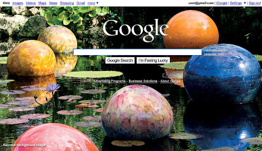
This background image did not serve you. It did not leave the interface clear and simple. The page did not load instantly.

2. It's best to do one thing really, really well.

We do search. With one of the world's largest research groups focused exclusively on solving search problems, we know what we do well, and how we could do it better. Through continued iteration on difficult problems, we've been able to solve complex issues and provide continuous improvements to a service that already makes finding information a fast and seamless experience for millions of people. Our dedication to improving search helps us apply what we've learned to new products, like Gmail and Google Maps. Our hope is to bring the power of search to previously unexplored areas, and to help people access and use even more of the ever-expanding information in their lives.

Google's search page is supposed to be so focused on search, its design is often shown as a march towards minimalism. Famously, a recent design iteration made most navigation elements invisible until the mouse moved, focusing attention on the single search box.

Today's forced "feature" staggered in the opposite direction, making the "one thing" page difficult to read and requiring a user to add a Google Account and sign in if the user wanted to get rid of the visual distraction from search.

3. Fast is better than slow.

We know your time is valuable, so when you're seeking an answer on the web you want it right away – and we aim to please. We may be the only people in the world who can say our goal is to have people leave our homepage as quickly as possible. By shaving excess bits and bytes from our pages and increasing the efficiency of our serving environment, we've broken our own speed records many times over, so that the average response time on a search result is a fraction of a second. We keep speed in mind with each new product we release, whether it's a mobile application or Google Chrome, a browser designed to be fast enough for the modern web. And we continue to work on making it all go even faster.

There's no question that a desktop sized .jpg image is orders of magnitude slower than no image at all.

Now, after web-wide outcry, the original blog entry at Google has been updated:

We had planned to run an explanation of the showcase alongside it—in the form of a link on our homepage. Due to a bug, the explanatory link did not appear for most users. As a result, many people thought we had permanently changed our homepage, so we decided to stop today’s series early.

Sure. It was really just a bug.

Google's ten things have helped make the web better, and users appreciate Google for that. It's no coincidence most of Google's so-called missteps in the past year have been violations of one or more of these ten principles.

Users don't like to feel used, so social usability matters even more than typography or information architecture.

Web application user experience managers should keep their implied—or in Google's case, written—social contracts in mind to guide design decisions: a social style guide.


Usability week ending May 9th

Thursday, 6th May, 9:45 AM
Developers show new UI controls, tech, code; claim to be talking about UX. But #UI is not #UX. Learn the facts: http://j.mp/cLwG29

Wednesday, 5th May, 12:31 PM
@jkatinger WebOS was iterating like a beta, still is, but the concept is sound and hopefully HP's hardware can work it.

Wednesday, 5th May, 12:17 PM
Quality offerings display self similarity. Any small part is indicative of the whole: http://j.mp/dreFj9 #ux #design #ia

Tuesday, 4th May, 8:46 PM
Use #wireframing as a process of divergence, transformation, and convergence, instead of as an artifact: http://j.mp/a29lzZ #ux

Tuesday, 4th May, 9:56 AM
@jkatinger If HP really makes a Slate based on WebOS that web developers program to using HTML5 and JavaScript, that could be a challenger.

Sunday, 2nd May, 11:25 PM
iPad Killer? We can't even get an iPad challenger... http://post.ly/eaeb

Sunday, 2nd May, 1:22 PM
UX book reviews to broaden your perspective: http://j.mp/9wDVgV #ux #usability #userexperience

via twitter.com/terretta

Usability week ending May 2nd

Thursday, 29th April, 1:24 PM
Flash was made for PCs and mice. The mobile era is about low power devices, touch interfaces and open web standards: http://j.mp/bTEU81 #ux

Wednesday, 28th April, 2:20 PM
You've heard of evidence-based medicine (eg., House). Here's the art & science of evidence-based #design: http://j.mp/aPmQ8X #ux #ia #ebd

Tuesday, 27th April, 11:42 AM
The interface design piece we most often overlook is emotional pleasure: http://j.mp/bFOtMv #ux #ui #design #userexperience

Tuesday, 27th April, 8:49 AM
@sugarsock If you live on remote servers, Transmit 4 really is that much faster. Panic Transmit 4, Mac OS X FTP + S3: http://j.mp/bVTbQT

Monday, 26th April, 6:41 PM
Maybe it's not a "bounce", maybe your visitor searched and then read just one perfectly relevant page: http://j.mp/bAmzzR #stats

Monday, 26th April, 12:20 PM
Five #iPhone #app #design mistakes, and how to fix them--dpi, storage, MVC, HIGs, orientation: http://j.mp/bOR48A

via twitter.com/terretta

Usability week ending February 21st

Friday, 19th February, 12:59 PM
Style guides are a great way to ensure user experience consistency. Here's how to make one: http://j.mp/9PFwca #ux #ui #ia #design

Friday, 19th February, 10:54 AM
For non-hierarchical sites, breadcrumbs are useful only to show a page’s relation to more general concepts: http://j.mp/a8i2Xg #ia #ui #ux

Friday, 19th February, 9:40 AM
#Apple has no pretense at “openness” but, unlike #Google, it thinks deeper when designing its products: http://j.mp/9f8smo #ux $GOOG $AAPL

Thursday, 18th February, 8:22 PM
Goal oriented "Activity-Centered Design" results in better technology than user study driven "Human-Centered Design": http://j.mp/aVuyiL #ux

Wednesday, 17th February, 12:37 PM
Warning: force feeding users can result in vomiting: http://j.mp/9JzHom #ux #userexperience #marketing #Google #Buzz $GOOG

Tuesday, 16th February, 12:45 PM
The $5 Guerrilla User Test--drunk people are a pretty accurate mimic of distracted, indifferent people: http://j.mp/9WOWem #usability #ux

Monday, 15th February, 11:20 AM
Google, these are your users http://post.ly/Nzdk

via twitter.com/terretta

Google admits Buzz social network user testing flaws

The BBC understands that Buzz was only tested internally and bypassed more extensive trials with external testers - used for many other Google services.

Google said that it was now working "extremely hard" to fix the problems.

"We've been testing Buzz internally at Google for a while," Todd Jackson, Buzz product manager, told the BBC. "Of course, getting feedback from 20,000 Googlers isn't quite the same as letting Gmail users play with Buzz in the wild."

In yesterday's post, I speculated Google Buzz was only tested by its own engineers. Today, Google admitted to the BBC that was true.

Jackson told BBC News that the decision to create these automatic lists was borne out of the idea that Google "wanted to provide a great user experience straight out of the box".

Well, not quite. Google focused on providing a great Google employee experience straight out of the box. The article reports even when Google does "user testing", it uses "a network of friends and family of Google employees". That sounds like a privileged class, not everyday users.

Google needs to refocus its core products for the real users making up its market share, before insular thinking damages Search audience driven revenue.

Google, these are your users

While we mock those users, the simple fact is they haven't necessarily failed, something failed them. With all of our talk about the semantic Web and search engine optimization and tailoring search results to the individual user, there are thousands upon thousands of users performing the same simple search and following the same wrong road. If this were a standard traffic sign misdirecting this many people, it would have been pulled down long ago.

People won't use your product the way you want. They'll use it the way that works for them.

Last week's Buzz was around Google's spectacular privacy missteps in the launch of its Twitter killer, but should have been around the other illustration of Google's more fundamental failure: becoming Microsoft.

In 2009, Ballmer famously derided a Microsoft employee for using an iPhone. Encouraging engineers to eat their own dog food is a great way to find pain points and fix them. Discouraging engineers from openly using best-of-breed products the way their users will use them is a great way to stifle both innovation and the understanding of what real users want.

Google's engineers were likely delighted when Buzz automagically preconfigured their Follow networks. Then again, engineers are not known for social skills. Engineering was so far removed from how "real people" would react to seeing their most emailed contacts exposed, they missed how even engineering's most avid disciples – tech bloggers – would react.

For this mistake, Google took a massive hit in public trust. Down the road, Buzz will be held up as an example of why one company should not be allowed to control too much of our information. Google semi-apologized (saying it was "sorry for the concern", not sorry for the feature) and will hopefully consider its non-engineering users' concerns in the future.

While Google can afford this mistake with Buzz, it should worry whether the same lack of connection with everyman puts its core product at risk.

If Google starts getting Search wrong, it is in serious trouble – and the "facebook login" incident suggests Google's getting it very wrong.

A decade ago, I switched to Google because it offered me a search box that led to nothing but results. That's all I wanted, and all it did. This match made in heaven catapulted Google ahead of Excite, Lycos, Altavista, and Inktomi.

While the search box has stayed the same, Google's users have not. Today's Googlers don't know the difference between a URL and a search term, or even between a browser and the Internet. (I talked about these users in an earlier article about the iPad, commenting on how removed bloggers are from "most people".)

By focusing on features such as real time web search or categorized results for tech-savvy users, Google is stranding its mass audience – a mistake its advertising business model absolutely cannot afford. Google needs to cater to the folks who ended up on ReadWriteWeb through their typical use path, making Google work for them and get them where they're trying to go, instead of trying to retrain them to adapt to Google.

Google needs to refine the "I feel lucky" button until it's good enough to be the default, helping the Internet's least savvy users find where they want to be even if they're doing it wrong.

An information appliance for the caveman in us

This past weekend, I overheard all too many conversations about the iPad, echoing complaints friends read online.  The most common was "Why do I need one when I already have an iPhone and a laptop?"

Stop right there.  

If you already have an iPhone and a laptop, you're among the technology elite, and a minority.  Put your iPhone back in your pocket, close your laptop lid, and look around you.  What are other people using?  If you're at a Starbucks or Panera Bread, or an office that supports the iPhone, the people you see are the minority too, so you'll have to look farther afield.

Most Americans aren't laptop and iPhone toting early adopter creatives commenting on blogs, emailing business plans, designing marketing materials or coding a startup.  Most Americans are consumers.  Most Americans spend their time on passive leisure that makes them feel happy.  

Instead of observing fellow laptop users at Starbucks, go find how "most Americans" use computers.  Watch people at a public library or even at the computer aisle in a Best Buy store.

When confronted with a keyboard (invented 1867), people don't touch type, they eyeball and poke at one key at a time.  Given a mouse (invented 1972), their gestures are tentative. They look at the screen, then look at their hand on the mouse, move it, and look back at the screen.  They want something from the computer, but the tediousness of telling it what they want frustrates them.

Why is a tool designed in 1867 for people creating office documents, and the esoteric skill required to operate that tool efficiently, still getting in the way of people just wanting to read an email, find a book or song, watch a video, or browse friends and family pictures on Facebook?  Why does it take a Steve Jobs to imagine most Americans don't want an electric typewriter with a nicer screen?

Who wants to have to learn this:

To do this:

Photo via Flickr/Scott Chang

Engineers should get out more.  This decade's netbook form factor is still dictated by vestiges of the typewriter age and the "data input" daily routines of academia and corporate America.  Regular folk don't type.  Regular folk poke, prod, and ogle.  How ironic, then, that regular folk may better appreciate than the technorati what the liberal elitist New York Times calls a triumph of taste?

Great products, according to Mr. Jobs, are triumphs of “taste.” And taste, he explains, is a byproduct of study, observation and being steeped in the culture of the past and present, of “trying to expose yourself to the best things humans have done and then bring those things into what you are doing.”

The iPad is an information appliance designed the way humans have seen and shared images and writing for millennia.  See what you want. Touch what you want.  If you can trace lines in the sand, you can use the iPad to imagine, create, and consume.

iA's "What’s Next in Web Design?"

Technology often develops from primitive to complicated to simple. The web develops faster and more client focussed than traditional technologies. Web development is cheaper, more flexible and most importantly: everyone can contribute to its development. In concrete terms: Better interaction design, less graphic design. Better user experience, less debates about taste. Faster technology, more reliable design standards.

iA predicts the future of web design by looking at What's Needed. After 15+ years of web design, you'd imagine some of this would be taken for granted, but then again, look at magazines...

Simplicity. iA points out most sites are still too hard to use. In our web design profession, we sometimes forget the users who think "screenshot" means taking a picture of the computer with their camera. Sites need to focus on a rational business model, simplify to do it well, and be approachable for non-insiders.

Speed. Physical interfaces offer instant feedback. Flipping through People magazine is far faster using paper than online. Web sites need to be designed for fewer clicks with less latency. Using them needs to feel fluid. iPhone apps such as Tweetie 2 are getting there.

Beauty. User experience isn't the skin, it's the interface. Designers need to work more on interaction style than visual style—less on what the CEO wants and more on what the end user needs.

Applying these, iA sees trends towards getting design out of the way and unifying user interfaces, through tools such as standardized web fonts, grid layouts, and UI libraries such as jQuery.